An exponential model?
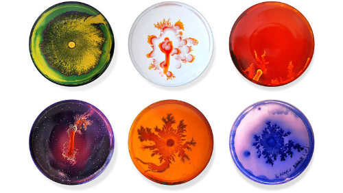
I've recorded some data about bacteria in a petri dish. I've plotted this data as a scatter graph, with time (in days) along the horiztonal axis and the size of the largest colony (in mm, measured along the diameter of the colony) vertically.
The correlation coefficient is already high: there is definitely a trend. But I think that an exponential curve would fit even better. My conjecture is that the variables are linked with an equation like .
Press "apply log coding" to apply to all of the values.
The correlation coefficient is much greater!
Can you use the equation of the new regression line to figure out estimates of the values of and ?
