Google Classroom
Google Classroom
GeoGebra
GeoGebra Classroom
Sign in
Search
Google Classroom
Google Classroom
GeoGebra
GeoGebra Classroom
Outline
SUNY - Stats
Interpreting Bar Graphs
Exploring a Cityscape Bar Graph
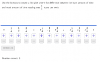
Creating Line Plots
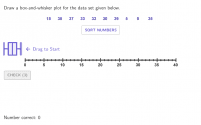
Drawing Box-and-Whisker Plots
Creating Histograms from a Data Table About a Popcorn Party
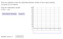
Creating Scatter Plots
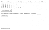
Interpreting Stem and Leaf Plots
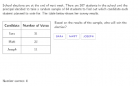
Predicting Population Trends Based on a Sample Population
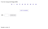
Finding the Interquartile Range
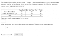
Interpreting Two-Way Tables
SUNY - Stats
Author:
MrValencia24
Interpreting Bar Graphs
Exploring a Cityscape Bar Graph
Creating Line Plots
Drawing Box-and-Whisker Plots
Creating Histograms from a Data Table About a Popcorn Party
Creating Scatter Plots
Interpreting Stem and Leaf Plots
Predicting Population Trends Based on a Sample Population
Finding the Interquartile Range
Interpreting Two-Way Tables
Next
Interpreting Bar Graphs
New Resources
רישום חופשי
Fourier Lissajous (Mechanical)
Some random function
seo tool
Model sferyczny - sześcian-ośmiościan
Discover Resources
Computer construction of polyhedra using sleiders
threeCircles
Math 10B Clock
sqrtab2-proof
Pythagorean
РГР2_Задача3
Discover Topics
Exponential Functions
Mathematics
Constructions
Solids or 3D Shapes
Stochastic Process or Random Process