Comparing and Graphing Ratios
How can you compare two ratios?
You and a friend are making cupcakes for a bake sale. You both want purple frosting, but are unsure of the correct ratio of food coloring to get the right purple.
You decide to make purple frosting by adding 1 drop of red food coloring for every 3 drops of blue food coloring.
Your friend decides to make purple frosting by adding 3 drops of red food coloring for every 5 drops of blue food coloring.
Copy the following table and fill in the amount of red drops you would need for each different amount of blue drops.
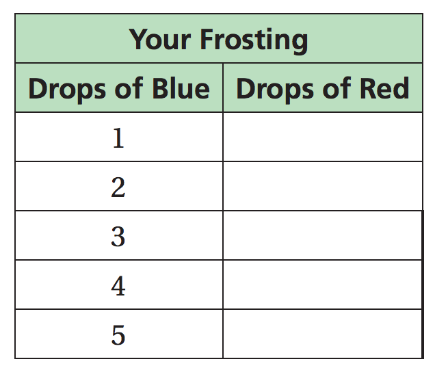
Your frosting
Plot the points from your frosting table by typing each coordinate pair in the input bar at the bottom of the graph. Make sure to use parentheses.
Your friend's frosting
Your graph should look like the one below.
We are now going to add your friend's recipe to the graph using a table within Geogebra.
Type in the number of blue drops needed for each amount of red drops using your friend's recipe.
Then ask your teacher or friend to help you get the points onto the graph.
Comparing the two recipes
Return to your previous graph. Use the line tool to connect the points for your recipe and a second line for the points that represent your friend's recipe.
What does each line in your graph represent? How might the line be useful?
Whose frosting is bluer? Whose frosting is redder? Justify your answers.
Which recipe do you think will create a more purple frosting?
Marca todas las que correspondan
- A
- B